How do we help everyday Indian shoppers understand ingredients instantly?

My Role:
My Role:

UI/UX Designer

Industry:
Industry:

Healthcare

Duration:
Duration:

4 weeks

Outcome
Outcome

A redesigned app and lots of learning

Overview

SafeBite is an India-first food-scanning app that uses barcode + AI ingredient analysis to decode any packaged food, even local brands. It gives simple, personalized health insights based on each user’s needs, making food decisions faster, clearer, and more trustworthy.

Overview

SafeBite is an India-first food-scanning app that uses barcode + AI ingredient analysis to decode any packaged food, even local brands. It gives simple, personalized health insights based on each user’s needs, making food decisions faster, clearer, and more trustworthy.

Why this Project? aka Backstory 💭

One evening I needed to order a prescription medicine and discovered Sayacare. The brand promise felt trustworthy with big savings but the app experience didn’t match that. The home felt busy, the prescription steps were unclear, and the order flow made me second-guess the process. If an experience meant to reduce stress ends up adding more of it, that’s a problem. So I decided to dive deeper…

What i initially Thought (My Hypothesis)

When I first used Sayacare, a bunch of small frustrations kept popping up. So I started asking myself:
(These later aligned strongly with actual user insights.)

What i initially Thought (My Hypothesis)

When I first used Sayacare, a bunch of small frustrations kept popping up. So I started asking myself:
(These later aligned strongly with actual user insights.)

Do users even know when a prescription is needed?

Do users even know when a prescription is needed?

Do users even know when a prescription is needed?

Do users even know when a prescription is needed?

Do users even know when a prescription is needed?

Do users even know when a prescription is needed?

Do users even know when a prescription is needed?

Do users even know when a prescription is needed?

Do users even know when a prescription is needed?

Do users even know when a prescription is needed?

Do users even know when a prescription is needed?

Do users even know when a prescription is needed?

Do users even know when a prescription is needed?

Do users even know when a prescription is needed?

Do users even know when a prescription is needed?

Do users even know when a prescription is needed?

Do users even know when a prescription is needed?

Understanding the Users 🔍

I didn’t have access to Sayacare’s actual customers, so I reached out to people I could reach
mostly 20–28year olds who order medicines online.
Not a perfect user group, but enough to spot meaningful patterns.

Research (Survey and Interview)

I kept research light but focused:

  • Online survey with 60 participants

  • 3 interviews with users who buy medicines online

How often do you order medicines online?
Have you ever felt unsure about which medicines require a prescription?  
Have you ever felt unsure about which medicines requires a prescription?
Have you ever felt unsure about which medicines require a prescription?  
 What would make you trust an online pharmacy more?
What would make you trust an online pharmacy more?
How much do you trust online pharmacies to deliver
safe and authentic medicines?
How much do you trust online pharmacies to deliver safe and authentic medicines?

Insights i got…

The patterns were clear and aligned closely with my hypothesis:

01

Users are still adapting to online medicine ordering.

They need more guidance and reassurance.

01

Users are still adapting to online medicine ordering.

They need more guidance and reassurance.

01

Users are still adapting to online medicine ordering.

They need more guidance and reassurance.

01

Users are still adapting to online medicine ordering.

They need more guidance and reassurance.

02

Trust in online pharmacies is moderate.

Average trust rating was around 3.4/5.

02

Trust in online pharmacies is moderate.

Average trust rating was around 3.4/5.

03

Prescription rules confuse users.

Half participants didn’t know at what step it was required.

03

Prescription rules confuse users.

Half participants didn’t know at what step it was required.

03

Prescription rules confuse users.

Half participants didn’t know at what step it was required.

03

Prescription rules confuse users.

Half participants didn’t know at what step it was required.

01

Users are still adapting to online medicine ordering.

They need more guidance and reassurance.

01

Users are still adapting to online medicine ordering.

They need more guidance and reassurance.

01

Users are still adapting to online medicine ordering.

They need more guidance and reassurance.

01

Users are still adapting to online medicine ordering.

They need more guidance and reassurance.

02

Trust in online pharmacies is moderate.

Average trust rating was around 3.4/5.

02

Trust in online pharmacies is moderate.

Average trust rating was around 3.4/5.

03

Prescription rules confuse users.

Half participants didn’t know at what step it was required.

03

Prescription rules confuse users.

Half participants didn’t know at what step it was required.

The Core Problem🎯


"How do we make Sayacare’s medicine ordering experience easy understand and easy to trust? "

After combining my initial observations with user insights, I narrowed the scope to four major issues:

Lack of clarity

Users don’t know when prescriptions are required

Lack of clarity

Users don’t know when prescriptions are required

Lack of clarity

Users don’t know when prescriptions are required

Low awareness

Generic medicines poorly understood

Low awareness

Generic medicines poorly understood

Low awareness

Generic medicines poorly understood

Moderate trust

Generic medicines poorly understood

Moderate trust

Generic medicines poorly understood

Moderate trust

Generic medicines poorly understood

Information overload

Visual noise cognitive in multiple screens

Information overload

Visual noise cognitive in multiple screens

Information overload

Visual noise cognitive in multiple screens

User Flow & Structure

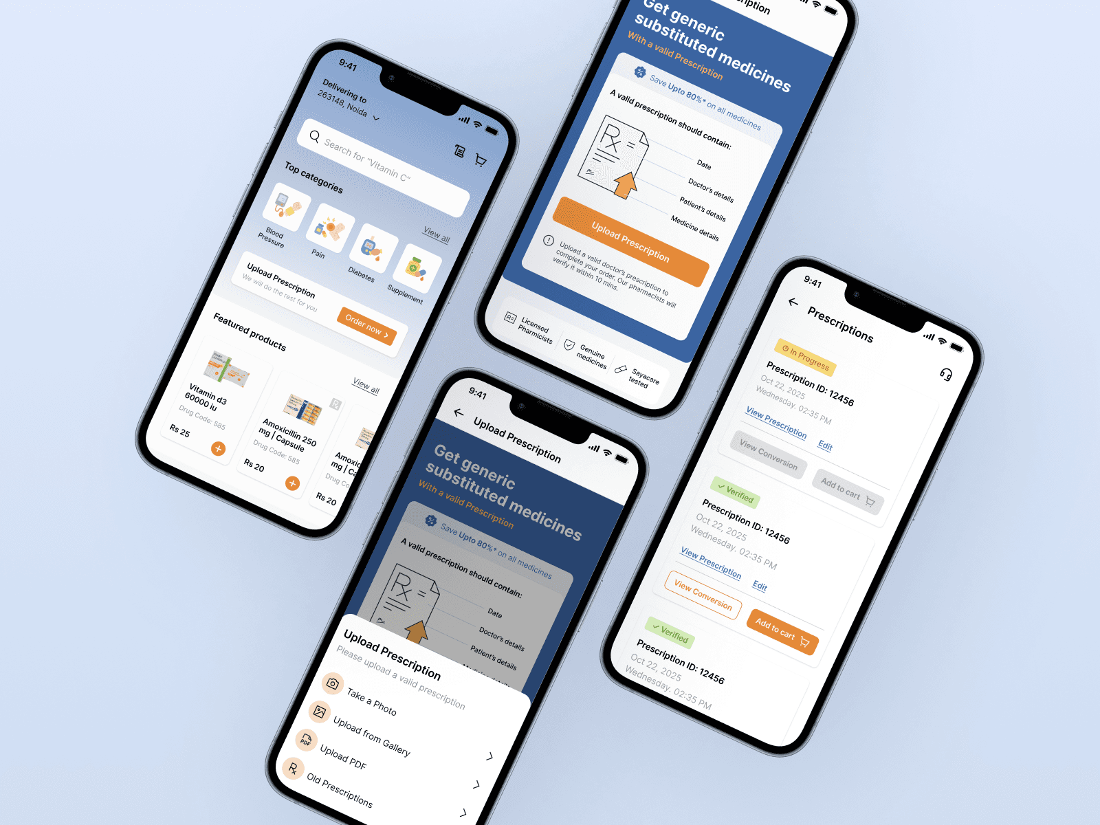
After identifying key friction points in Sayacare’s existing prescription upload process, I restructured the entire flow to reduce user confusion and decision fatigue.

Early Explorations

Before moving into structured flows and UI, I usually explore quick ideas on paper. These rough sketches helped me understand what needed simplifying, how users might move through the prescription flow, and how trust cues could be surfaced naturally.

Low Fidelity Explorations

Iterations

Designing the prescription flow took a few rounds of exploring what felt simple, what felt confusing, and where the unnecessary complexity lived. Each iteration taught me something different about how users understand (or don’t understand) prescriptions online.

Opt 1

The first version seemed flexible at first, it actually created more confusion. 
A medicine bill isn’t a legally valid prescription, and a medicine photo still requires pharmacist verification, meaning users eventually had to upload a real prescription anyway.

WHAT I LEARNED

More options don’t always mean more clarity especially in healthcare flows.

Opt 2

This version removed the extra ordering methods, which made the screen cleaner and focused. It was helpful information, but it raised a new question “What exactly counts as a valid prescription?” So instead of reducing friction, it added a small moment of doubt right before the primary action.

WHAT I LEARNED

Clarity improves when the screen has fewer decisions, but priority hierarchy still matters the main action should always feel effortless.

Opt 3

The third version finally tied everything together. The hierarchy became clearer, the prescription guidelines were visually simplified. This version felt calm, intentional, and aligned with how healthcare products should communicate.

WHAT I LEARNED

A good redesign isn’t just removing steps it’s about guiding the user with clarity, confidence, and minimal cognitive load.

Opt 1

The first version seemed flexible at first, it actually created more confusion. 
A medicine bill isn’t a legally valid prescription, and a medicine photo still requires pharmacist verification, meaning users eventually had to upload a real prescription anyway.

WHAT I LEARNED

More options don’t always mean more clarity especially in healthcare flows.

Opt 2

This version removed the extra ordering methods, which made the screen cleaner and focused. It was helpful information, but it raised a new question “What exactly counts as a valid prescription?” So instead of reducing friction, it added a small moment of doubt right before the primary action.

WHAT I LEARNED

Clarity improves when the screen has fewer decisions, but priority hierarchy still matters the main action should always feel effortless.

Opt 3

The third version finally tied everything together. The hierarchy became clearer, the prescription guidelines were visually simplified. This version felt calm, intentional, and aligned with how healthcare products should communicate.

WHAT I LEARNED

A good redesign isn’t just removing steps it’s about guiding the user with clarity, confidence, and minimal cognitive load.

Design Solutions🎨

  1. Clarity Around Prescription Requirements

To remove confusion around prescriptions, I redesigned the flow to make the entire experience more transparent and predictable for users:

  • Added an RX tag on medicine cards

Redesigned the prescription upload flow
  1. Making Order process Clear and Stress-Free

After fixing the prescription flow, the next big friction point was the order experience. Users on Sayacare had no real sense of where their order was. The original flow felt flat, text-heavy, and disconnected from the emotional side of buying medicines where clarity matters the most.

  • Clear order status labels along with Verified tags

Final Prototype

What I Learned


1. Clarity beats flexibility.
Giving people three different upload options felt helpful, but in healthcare flows, “more choices” actually means “more confusion.” A single, focused path is almost always the safer and clearer route.

2. Users don’t read they react.
Most confusion around prescriptions wasn’t because users lacked intelligence, but because the interface didn’t guide them. The Rx tag + inline checklist worked way better than long instructions.

3. Don’t assume legality validate it.
I assumed medicine bills could work as prescriptions… until I reached out to Sayacare directly. That one message clarified the entire flow. Talking to real people saves hours of redesign.

4. Healthcare needs reassurance, not speed.
People aren’t just uploading a file; they need to feel safe. Small details like “Verified by Pharmacist,” upload success feedback, and a clear status timeline ended up making a huge difference

Let's create smth exceptional !

Let's create smth exceptional !

Let's create smth exceptional !

Let's create smth exceptional !

Let's create smth exceptional !

Let's create smth exceptional !

Create a free website with Framer, the website builder loved by startups, designers and agencies.