AI-powered Ingredient scanning app for Indian grocery shoppers
Ingrify was created to address a growing frustration shared by everyday consumers that is ingredient labels are complex, confusing and inconsistent , making it hard to know what’s actually safe to eat in a glance.
I collaborated across teams to gather user feedback and created the app's user experience, interface with seamless access to brand values.
10K +
Downlaods
4K +
Active users

Role
Product Designer
Project Type
Health & Food, Tech
Timeline
Jan'25– May'25
Team
1 Designer , 1 PM , 4 Devs
Role/
Research
Performed competitor analysis, created user-personas , conducted 4 user interviews and 2 rounds of user testing, and synthesized insights into actionable design ideas.
Design
I joined as the sole designer after the dev-prototype was build and feasibility was proven, I rebuilt the experience from the ground up. I established the product’s visual identity and keeping it intact throughout the design process.
Problem Discovery/
Backstory
The goal was to help users quickly understand what’s inside packaged food. To achieve this, the product team initially built an AI-powered prototype using OCR to extract and explain ingredient labels across any product.
Problem
Ingredient labels are widely confusing, but confusion alone doesn’t drive behavior. Existing solutions break at the moment users need them most:
• AI scans depend heavily on image quality and label consistency, leading to missed or inaccurate insights.
• Barcode-based apps often provide generic rating ignoring the individual needs and most of them fail for Indian products.

Same product different result
Challenge/
How do we help everyday Indian shoppers understand ingredients instantly?
Building a MVP
Through stakeholder discussions and competitive analysis, I proposed introducing barcode scanning as the primary entry point, with AI ingredient analysis as a fallback when products weren’t available in the database.
AI Ingredients Scan
Captures dietary preferences and allergens early so scores and warnings adapt to individual needs.
Barcode Scan
Captures dietary preferences and allergens early so scores and warnings adapt to individual needs.
Research/
Primary Research
I ran a quick survey with 30+ participants and 4 user interviews with everyday Indian consumers. Even with a small sample size, clear patterns emerged…
Secondary Research
I conducted Secondary research using existing studies, industry reports, and public discussions around food labels in India
Key Insights

Simplicity
Most want quick Good vs Bad ingredient clarity first, with deeper breakdowns only when needed.
Relevance
People with allergies or dietary restrictions expect insights tailored to them, not generic ratings.
Personalization
People with dietary restrictions want products that match their health needs
80%
notice labels but rarely read ingredients
20%
engage with ingredient or nutrition details
60%
find labels hard to understand
Insights from NCBI
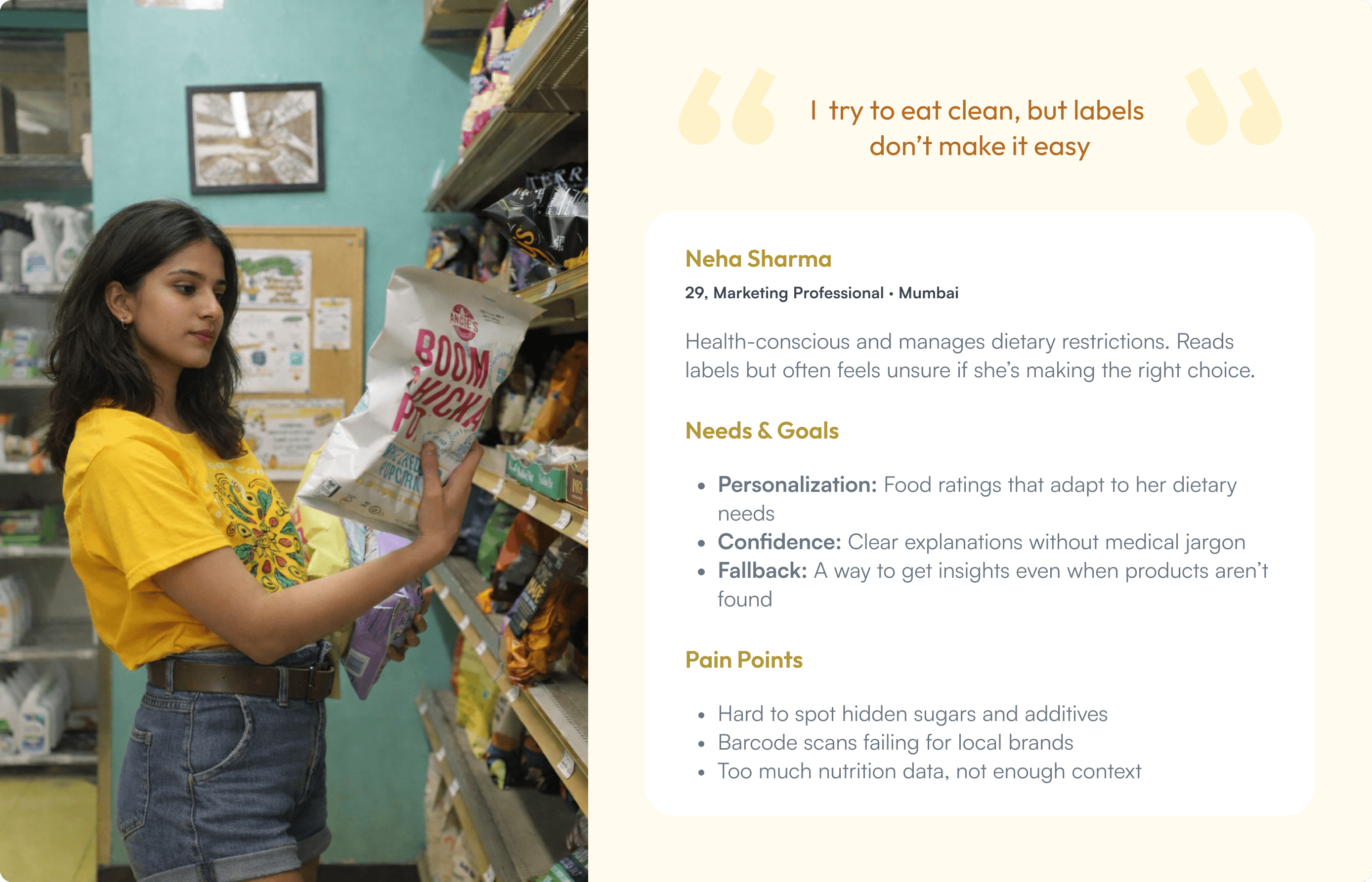
User Persona
It captures the strongest patterns from prospect users and guides initial design decisions while leaving room to evolve as more real user data comes in.

Competitor Analysis
I analyzed competitors like TruthIn, Yuka, TrashPanda to understand how users move from scanning to interpretation.
Goals
Establish what the market looks like right now. See if there is a direct competitor in this specific idea. Learn how other food scanning apps work.
Result
Most apps relied heavily on Barcode scan which depend on their or third-party database coverage and generic health scores, which struggle with Indian products and personalized needs.

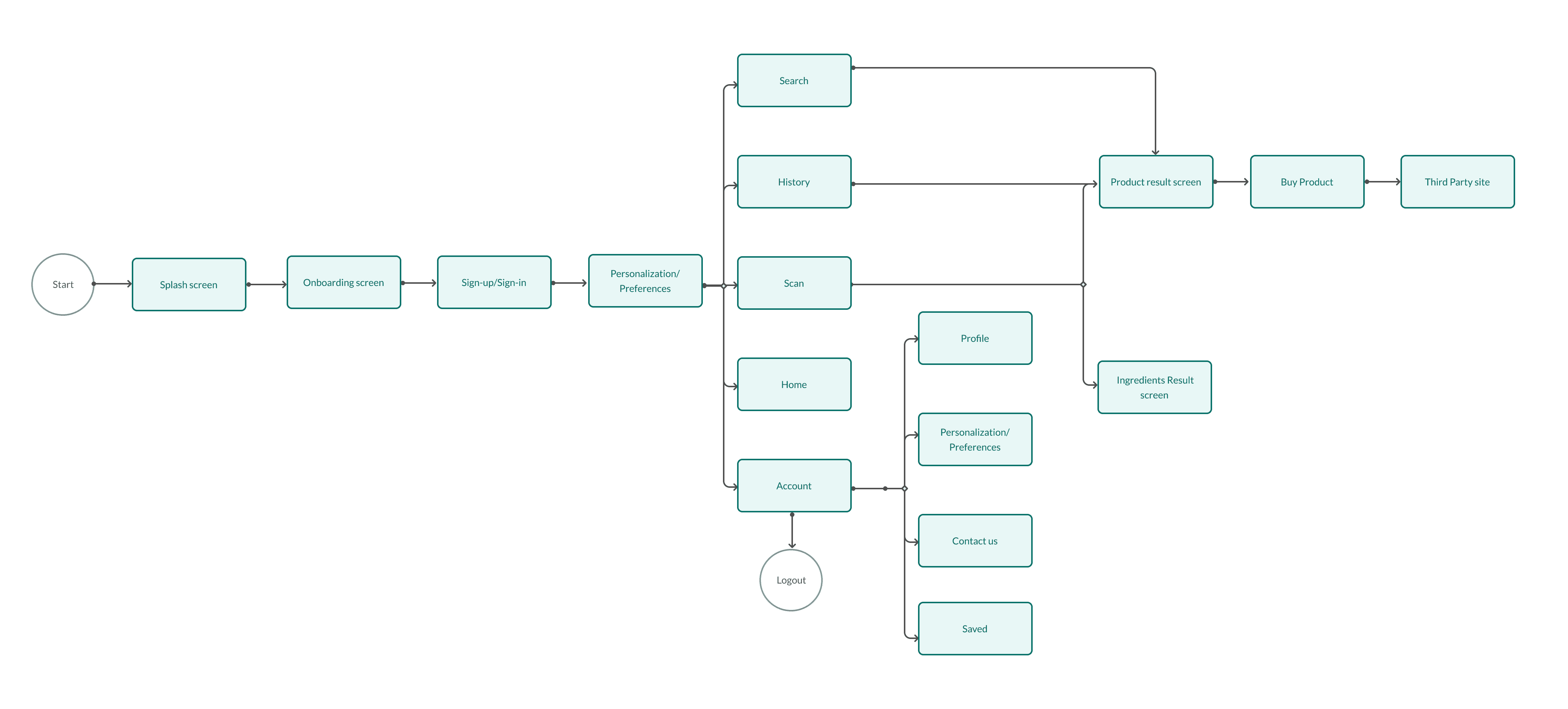
User flows
By prioritizing clarity and speed, the flow keeps the experience effortless and reduces decision fatigue.
Testing & Iterations/
Internal Testing was done to quickly validate core flows, this helped identify technical edge cases, performance issues, and accuracy gaps. Based on user feedback and testing the product underwent few round of iterations. Key insights from user feedback included:


Design Decisions & Trade-offs/
Barcode vs AI scan
Barcode for speed and accuracy on known products; AI as fallback when data is missing.
Generic vs Personalized scoring
Generic scores reduce friction; personalization is layered in only when users opt in.
MVP speed vs Features
Non-essential features were cut to validate the core scan experience fast.
Automation vs System sustainability
Reducing repeated AI scans lowered costs and improved long-term scalability.
Success Metrics/
The success of this app and it’s features were measured by:
📈 Adoption & Engagement
Growth in active users and scan frequency, indicates that users found real value in scanning products.
⭐ Trust & Satisfaction
High app ratings and repeat usage, validates that ingredient insights were clear, and easy to act on.
🧠 Coverage & Cost Efficiency
Improved product database through user-added products, reducing repeated AI analysis costs.
Key Learnings/
Collaboration & Communication
I learned the importance of close collaboration with stakeholders and developers in an early-stage product. I learned how to take a stand on design decisions by backing them with user research, competitive insights, and clear success metrics rather than opinions. This helped align teams, navigate trade-offs around cost and feasibility, and ship decisions that balanced user trust, technical constraints, and business goals.
Designing for imperfect data
Working with third-party databases meant scan failures, mismatches, and incomplete results were inevitable. Instead of hiding these limitations, we designed clear fallbacks ingredient scan, AI analysis, and user reporting to keep the experience intact even when the system wasn’t perfect.


What's Next?
Point Based Reward System
A reward system where users earn rewards for adding verified products and referring others. This aims to encourage high-quality contributions while keeping database growth community-driven and sustainable.
Quiz
Add learning moments that help users understand ingredients over time and keeps engagement high without disrupting the core scan flow.