Sayacare
Bringing Clarity and Trust to Online Medicine Ordering
Sayacare is an online pharmacy that provides affordable, double-tested generic medicines. I genuinely liked the idea same quality but at way lower prices I studied the experience, ran a quick survey, and redesigned the friction points, this case study captures how the core flows were transformed for clarity and trust
Timeline
Jan 25– March 25
Project Type
Health, Pharmacy
Role
UI/UX designer
Skills & Tools
Figma
User interviews
Prototyping
User testing


MY ROLE & IMPACT
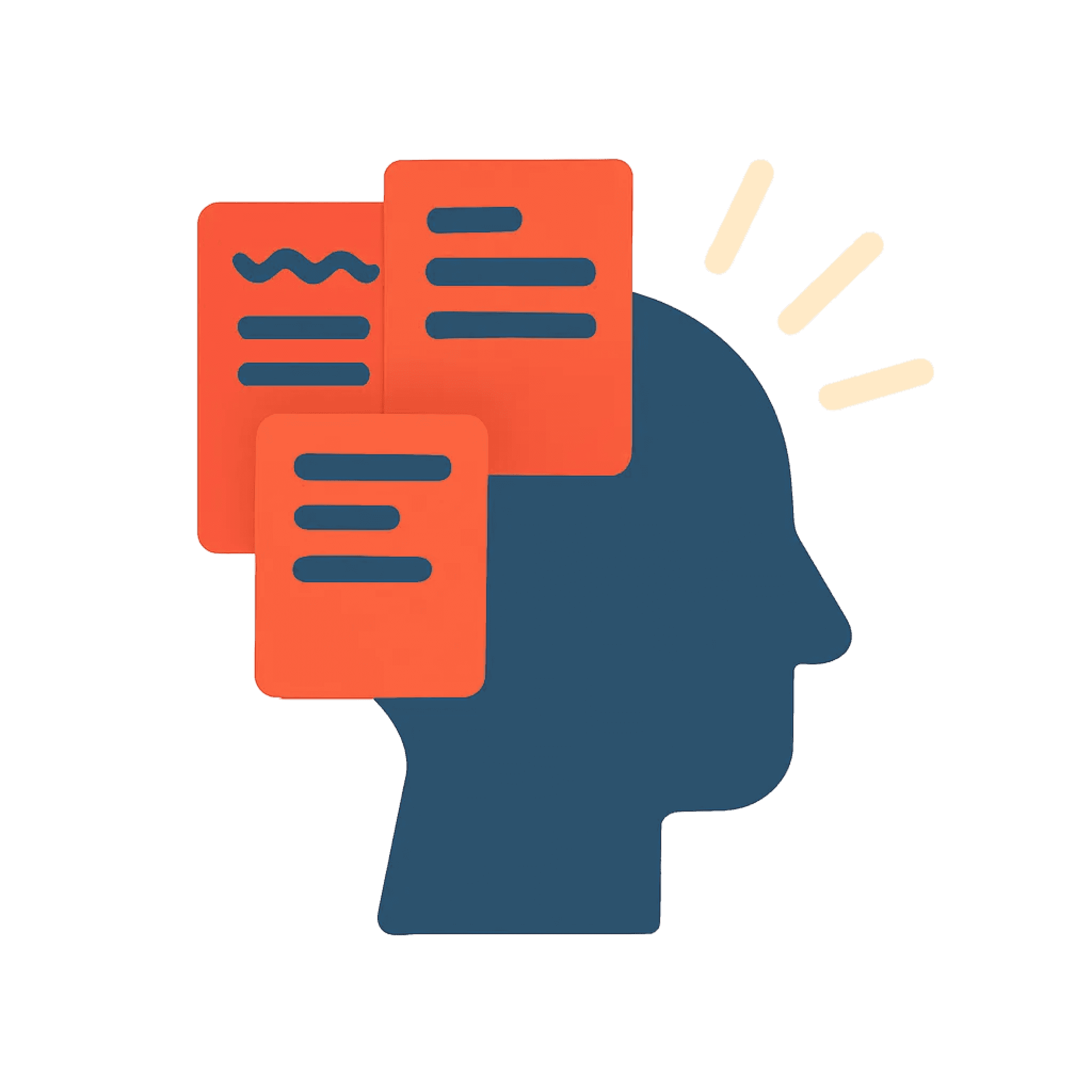
Research
Performed competitor analysis, created user-personas , conducted 6 user interviews and 2 rounds of user testing, and synthesized insights into actionable design ideas
Impact
Sharing this case study with the Sayacare founders led to a detailed discussion around prescription clarity and trust. Shortly after, Sayacare introduced clearer prescription cues in the cart experience reinforcing the importance of addressing prescription requirements before checkout.

BACKSTORY
HYPOTHESIS
When I first used Sayacare, a bunch of small frustrations kept popping up.
So I started asking myself…

CHALLENGE
DESIGN SOLUTIONS
Clarity Around Prescription Requirements


A Clear order Process


Discover
Desk research
Competitor Analysis
I conducted an in-depth analysis of competitors in the Indian digital pharmacy space to understand how prescription requirements and trust signals are communicated.
Competitors: Tata 1mg, PharmEasy, Netmeds, Apollo 24|7
The analysis showed that while most platforms display an Rx indicator on medicine cards, users are often still allowed to proceed through checkout without completing prescription upload till the payment screen.
Surveys & Interviews
Key Insights


Ideation
Early Explorations
Before moving into structured flows and UI, I usually explore quick ideas on paper. These rough sketches helped me understand what needed simplifying, how users might move through the prescription flow, and how trust cues could be surfaced naturally.

Low Fidelity Explorations
Iterations
Designing the prescription flow took a few rounds of exploring what felt simple, what felt confusing, and where the unnecessary complexity lived. Each iteration taught me something different about how users understand (or don’t understand) prescriptions online.


User Flow
After identifying key friction points in Sayacare’s existing prescription upload process, I restructured the entire flow to reduce user confusion and decision fatigue.

Design

Upload Prescription

Order Flow
KEY LEARNINGS
Designing for trust-critical flows
In healthcare experiences, visual clarity alone is not enough. Allowing users to proceed too far without enforcing prescription requirements increased anxiety and reduce trust.
Clarity over Convenience
By intentionally introducing clarity-driven interruptions (Rx indicators, checkout prompts), the experience became more trustworthy and aligned with offline pharmacy expectations